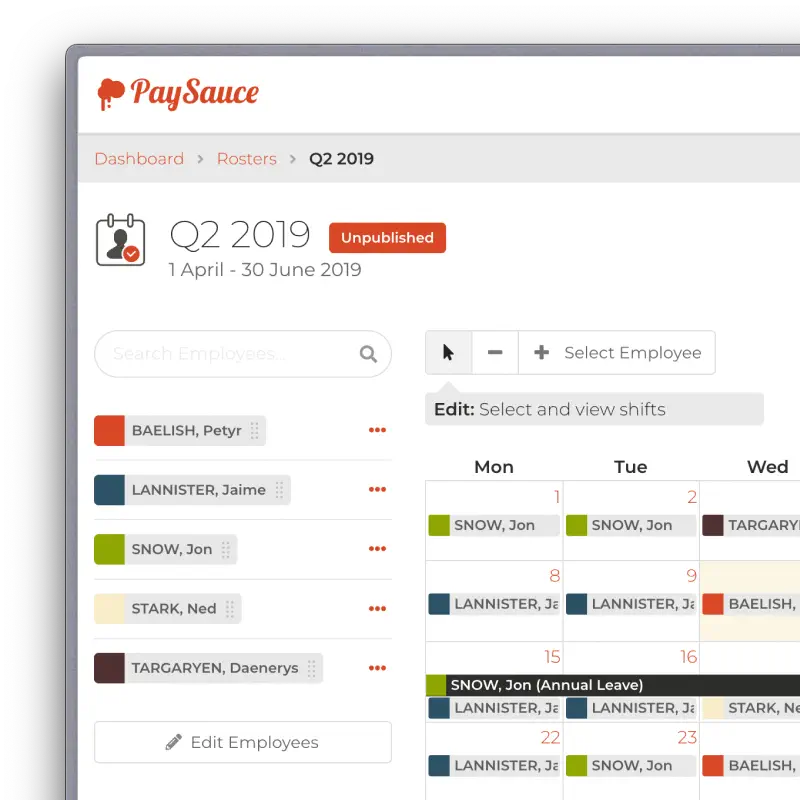
Rosters
Specialised on-farm shift management solution
Understanding the Business Needs
DairyNZ were refocusing their resources and were no longer wanting to support their rostering tool for farmers. PaySauce wanted to complement their payroll and timesheet product with a rostering solution and agreed to step in.

I needed to design a solution which worked within the PaySauce platform and had feature parity with the DairyNZ tool.
Our team also had limited resources and time, so needed a clear workable solution.
Research & Gain Insights
Myself and a business development manager interviewed the team at DairyNZ to understand what their farmers needed and the features they most liked about their current tool.
I looked at many other rostering solutions in the market to identify the gaps with DairyNZ's offering and to surface other valuable features.
I also had access to a lot of feedback from various NPS feedback surveys and general support queries where our customers had identified their needs for a rostering solution. It was also a topic which came up often at Fieldays when I was talking with customers.
Analyse & Ideate
With all of the information available, I looked for patterns and pain points for our typical users.
Farmers have a unique set of requirements. Their rostering patterns are different to most service jobs as they don't work standard work weeks. So the solution needed to be optimised for them.

Information Architecture & User Flows
As the platform which would host the rostering app was already designed, I knew how it would fit into that high level architecture.

For the specific modules, I had to design distinct workflows for both the manager and the employee.
The manager would primarily use the web app to create and publish rosters. This included entry points from the main navigation and dashboard widget. It also required upgrade paths for upselling to higher tier plans.

They also had a mobile view within the mobile app to view previous and current rosters.
The farm workers would use the mobile app to view their shifts. It needed to be future proofed for planned enhancements such as shift swapping, recording notes and integrating other wider platform features.
Wireframing
I used rough sketches to organise initial layouts. This allowed me to quickly test if all feature requirements could be accommodated in an organised hierarchical format.
Prototyping
I already had a coded platform for high-fidelity prototyping for both web and mobile. These platforms allowed me to rapidly produce pixel-perfect layouts and workflows, including animations, memory states and advanced conditional logic.
Testing
Having working prototypes allowed for true real-world testing which yielded fantastic feedback which fed into the iteration loop.

Several rounds of usability testing, both internally and with customers, allowed me to fine-tune the designs.

Development Handoff & Support
As the prototypes were built in code, developers found it much easier to work with as they could inspect the source. This sped up the delivery time.
Notes were provided inside the prototypes to describe why and how some things should behave.

As the product was being built I worked with the developers to unblock any issues which arose and ensured design standards were met.
After launch, PaySauce was able to include it into their top-tier pricing plan, encouraging customers to upgrade.