Plan Review
A foundation people can trust
Overview
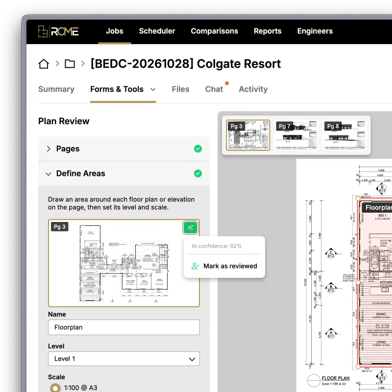
Plan Review turns a set of building plans into a structured, trusted foundation for every tool that follows it. AI does the first pass. People review it, correct it and sign it off, and they can always see which is which.
I designed and prototyped Plan Review for ROME, a platform for the internal truss and frame designers. It replaced a task users had to do twice, in two separate tools, and made AI output visible and accountable for the first time.
I also used AI in my own prototyping workflow, which let me build a deeper, more realistic prototype in a couple of days rather than a couple of weeks.
The Problem: A Shaky Foundation, Built Twice
Everything in ROME starts with the plans. Before anyone can produce a material take-off or check a design, someone has to pick the right pages from a PDF and define the floor plan areas on them: which drawing is Level 1, which is Level 2, and what scale each one uses.
That task lived in two places. The Material Take-Off tool had a pages area where AI and users defined plan areas. Confirm & Correct, which usually came earlier, asked users to do the same thing. Users could use either tool, both, or skip one, so they often repeated the work, or ended up with two versions of the same plans that didn't match.
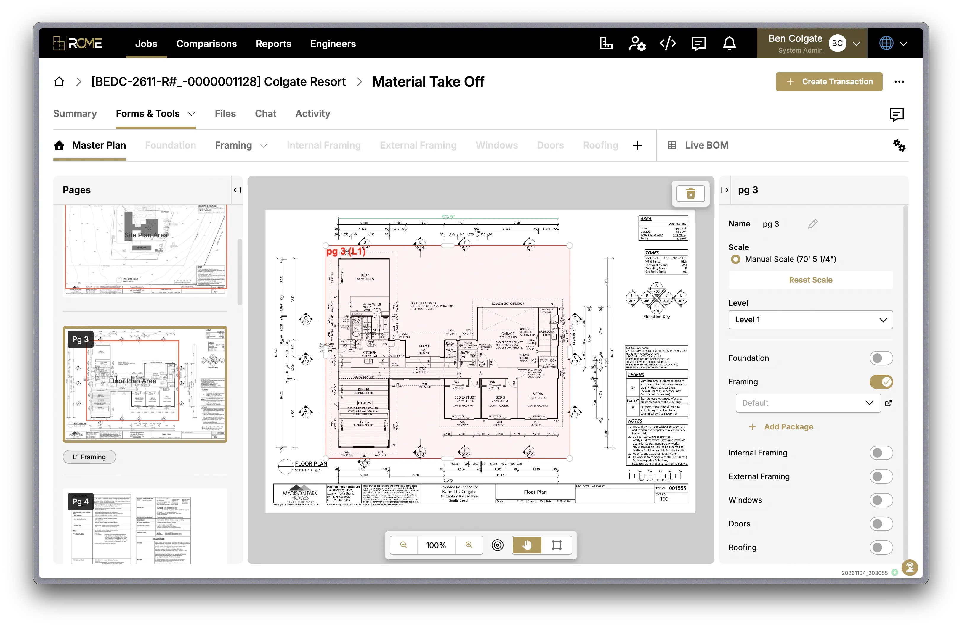
AI was already detecting areas in both tools, but its work was invisible. Users couldn't answer two basic questions.
Should I check this? No confidence level was shown, so every area looked equally reliable. A careful user checked everything. A rushed user checked nothing.
Has anyone checked this? An AI guess and an area a person had drawn looked the same. Once the plans moved downstream, nobody could tell which was which.
Unverified AI guesses could quietly become the foundation for take-offs and checks, twice over.
Restructuring the Flow
The first improvement wasn't AI. It was recognising that pages and areas didn't belong to either tool. They were the foundation both tools relied on.
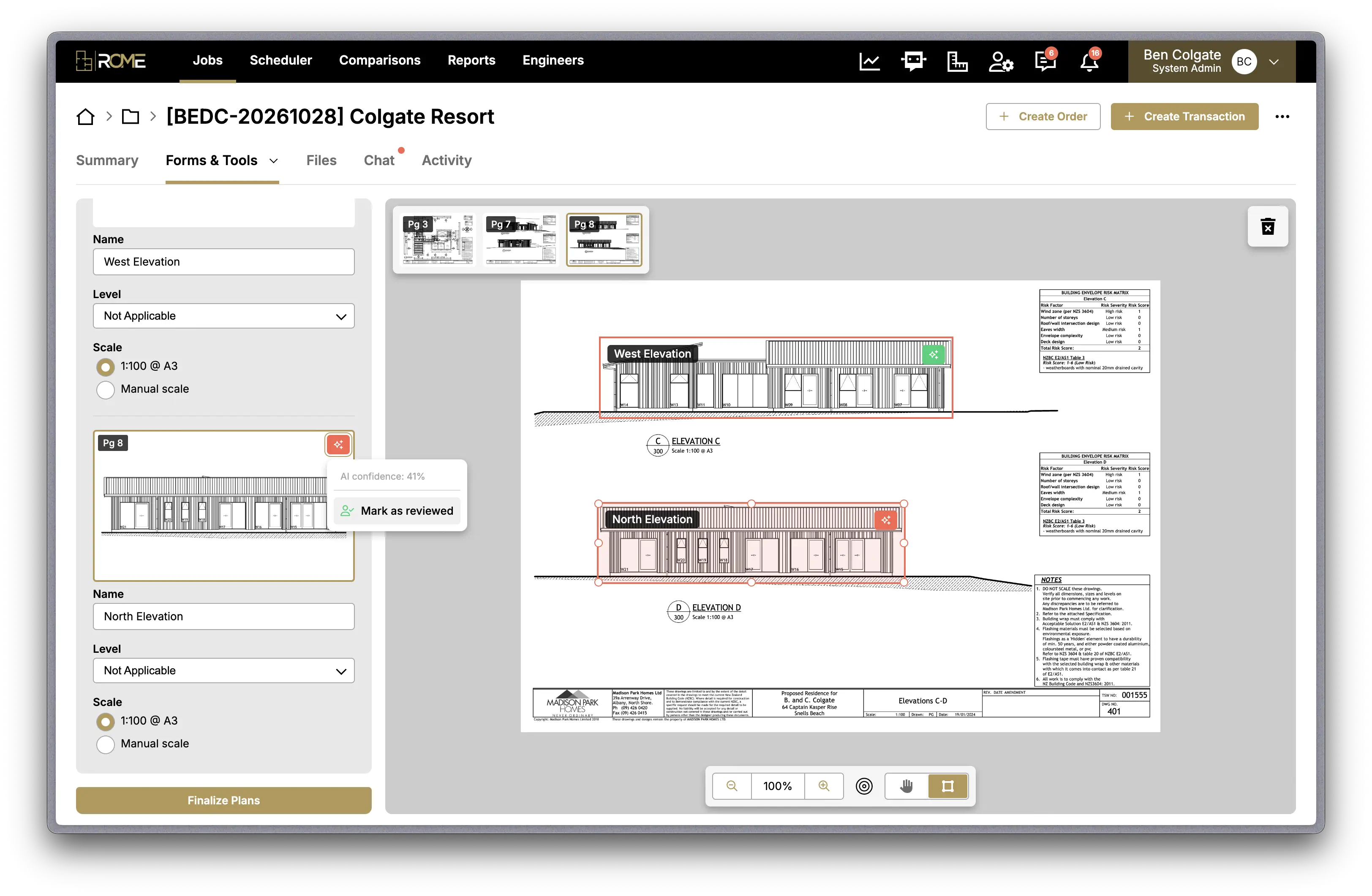
I moved that work into its own step, Plan Review, which comes before both. Users select pages, rotate them, define floor plan areas, set levels and set scales once. The Material Take-Off tool and Confirm & Correct then use the same pages and tagged areas.
Confirm & Correct has a hook that opens Plan Review directly, so users can view and edit the plans without leaving their flow. The Material Take-Off tool will get the same hook.
This doesn't add a step to anyone's workflow. Pages and areas always had to be defined before either tool could do its job. Plan Review turns two copies of that task into one unified, shared utility.
Designing for Trust
With plans defined in one place, it was worth designing the AI layer properly. I treated "trust" as two separate problems, because one "AI" badge can't answer both.
Should I check this? Show confidence. Every AI-detected area carries a small traffic-light tag: red, orange or green for low, medium or high confidence. Hovering shows the exact score. Reviewers can go straight to the red and orange areas instead of checking every box with the same care, which puts their time where the AI is least sure.
Has anyone checked this? Show provenance. Three patterns make it clear who is responsible for each area.
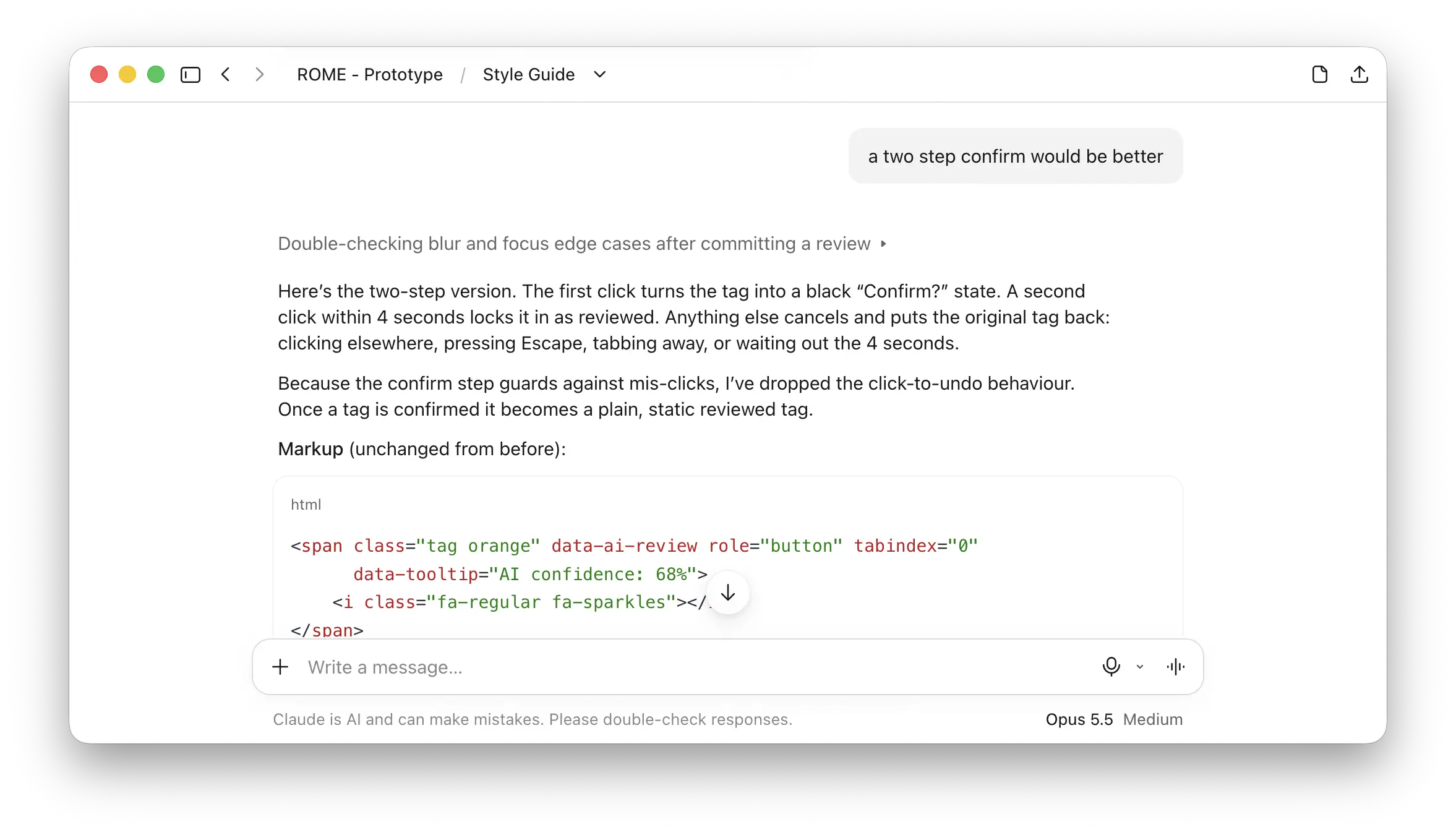
Review with a two-step confirm. Clicking a confidence tag turns it into a "Confirm?" state. A second click marks the area as reviewed, and the tag changes to a green person-check icon. Clicking away, pressing Escape or waiting cancels it.
Ownership passes to the person who edits. If someone moves or resizes an AI-detected area, its tag changes from AI confidence to "Created by" and their name. The area is now theirs, not the AI's.
A lasting record. After the plans are finalised, the tags stay visible but become read-only. Anyone downstream can see what the AI suggested and what a person confirmed or drew.
The first version of the review interaction used click-to-undo: one click marked an area as reviewed, and a second click reversed it. I replaced it with the two-step confirm. Marking something as reviewed is a statement that a person has checked it, so it should take a deliberate action, not a single click that might be a mis-click. For a trust signal, preventing mistakes matters more than making them easy to fix.
AI in My Own Workflow
I've always prototyped in code rather than only in Figma. I hand-wrote HTML, LESS and jQuery as CodeKit partials, built on ROME's own design system, so developers received prototypes that behaved like the real product.
For Plan Review, I brought AI into that workflow without replacing any of it. The same partials, the same compiler and the same design system went to developers in the same way. The team got richer prototypes without having to change anything about how they worked.
Faster, but mostly deeper. Plan Review took roughly a couple of days to prototype, rather than the couple of weeks it would have taken by hand. The bigger change was what I could afford to build. A hand-coded version would have used static thumbnails and fake AI areas. With AI, the prototype renders real PDFs, generates live thumbnails of each defined area, lets people drag and resize areas, and syncs those areas into Confirm & Correct as they change.
That depth matters most for an AI product. A static mockup can show a confidence tag, but it can't tell you whether the trust design works. To find out, people need to load a real plan, see the AI's suggestions on real pages, move a box and watch it change to "Created by".
Guardrails, not autopilot. AI was fast but not reliable on its own. Early on it wrote custom styles where the design system already had a class, imported scripts twice, and let code from one prototype leak into another on the same page. Rather than fixing the same mistakes every time, I built two things to keep it on track.
A coded style guide documents every component in the design system with working examples. It's the source of truth for what already exists.
Developer notes record conventions, common pitfalls and lessons learned, so each new piece of work starts from what the last one taught us.
New patterns, like the AI review tag, were designed in conversation and then added to the design system, so they're available to the rest of the product.
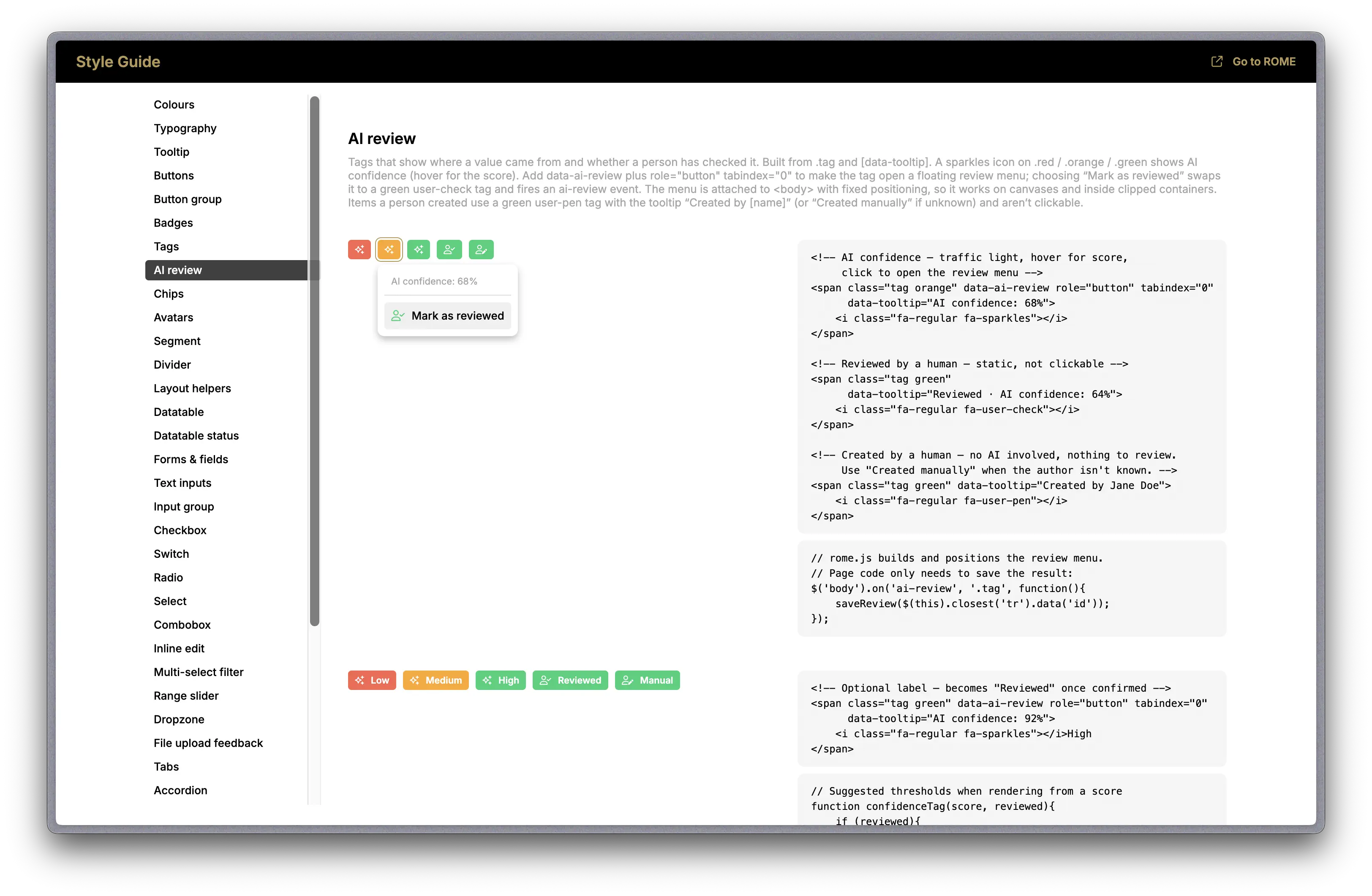
Who decided what. AI handled the depth: PDF rendering, thumbnail generation and syncing between tools. I tested everything in the browser, and the design decisions stayed with me, including three levels of confidence, the two-step confirm, ownership passing to the editor, and read-only tags after finalising.
Where It Stands
Plan Review is in active development and hasn't reached production yet, so I can't share usage data. These outcomes already hold.
One task instead of two. Users define pages and areas once, and both downstream tools use the result.
One source of truth. The Material Take-Off tool and Confirm & Correct can no longer disagree about the plans.
Review effort goes where it's needed. Confidence tags point reviewers to the areas the AI is least sure about.
Accountable output. For the first time, anyone can see whether an area came from the AI, was confirmed by a person, or was drawn by one.
Once it ships, I'll measure the time from uploading a PDF to finalised plans, the share of AI-detected areas accepted without edits at each confidence level, how often people correct or redraw AI areas and on which kinds of drawing, and whether downstream tools need fewer plan corrections.
What I Learned
The most valuable change in this project wasn't AI. It was moving one task upstream so it only happens once. Only after that did designing the AI layer properly become worthwhile.
Working with AI followed the same path as the product. Its output was fast but not trustworthy by default, so I built ways to check it and keep it consistent. Users need the same thing from Plan Review: AI that does the heavy lifting, and a clear view of what a person has actually checked.