Octane
Fuel50 Design System
Understanding the Business Needs
The Fuel50 app had evolved over a long period of time. Through the years many different teams had worked on many different parts with different technologies and UI frameworks. It was a mixed bag that lacked consistency.
The business knew it needed to create a more uniform and seamless experience but struggled to make a start. This was in part due to limited resources and indecision.
My role was created to ensure there was a dedicated resource which could focus on establishing a robust design system.
Research & Planning
The first thing I did was audit the application and existing designs to establish common elements. I also used this as a base to prioritise which components were in higher demand.
I also surveyed what work was coming up which might require unique components. These were also prioritised in the design system roadmap.
Define Principles & Standards
The design team already had a partial design system based on a version of the Atomic Design methodology, so we continued using that method to organise the new system.
The development team were struggling to pick a front-end library on which they were going to adopt moving forward, and we had no time to wait, so the design team agreed to align many of our design system components on Material Design, but also try to be as UI library agnostic as possible. This meant not allowing the designs to be to strongly opinionated.
Some UI standards were already established which aligned with the brand, so it was important to adhere to those. But at he same time, they also wanted to ensure everything was WCAG 2.1 AA accessibile, so that meant adjusting some of the existing colours when required.
Select Primary Environment
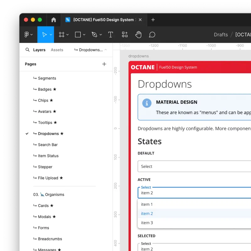
To cover all interactive states for standard HTML elements, including less obvious ones like focus-visible for keyboard navigation, it was faster and more interactive to build the first version in code with HTML/CSS/JavaScript.

After building components in code, it was then translated to Figma.

Establish Base Styles
Beginning with the Atoms (colours, typography, spacing, etc...), the core of the design system needed to be established.
The Fuel50 application is a white-label product, allowing customers to customise the colour scheme.
Both the code and Figma versions of the design system took advantage of variables to test different colour schemes.
Core HTML Components
The next level of Atomic Design is the Molecules. These were mostly based on standard HTML tags like buttons, tables and inputs.
The code based design system could leverage true browser interactions to present the different styles for states. These included animations and keyboard interactions.
Complex Organisms
Moving up the Atomic Design methodology, Organisms are components which use two or more lower level elements to form a component.
These also included more bespoke components and elements.
While some things were easily achieved in HTML & CSS, they often proved challenging in Figma. For example, complex layouts for variants or advanced CSS properties which are not available in Figma. But through perseverance I always managed to find a work-around.
Development Partnership
With the bulk of the design system in place, we could then partner with the front-end developers, who had at this point finally settled on a UI library, to update their Storybook implementation.

Best of Both Worlds
With both versions of the design systems available, we could leverage either environment to produce pixel accurate layouts.

Both environments have their strengths and weaknesses. Figma is more familiar tool with the majority of the design team. While the coded version offers greater power and flexibility for advanced prototyping and can communicate more natively with developers.
