PaySauce Brand
Creating a new look for the future
Tasked with coming up with a new brand which could take the compnay into the future, I set upon coming up with a name which:
- is short
no more than two syllables - uses english words
to make it easier to spell - was available online
the .com url and social handles weren’t already taken - is aligned with the company and culture
needed to be relevant and fun - is unique and memorable
not to be confused with others
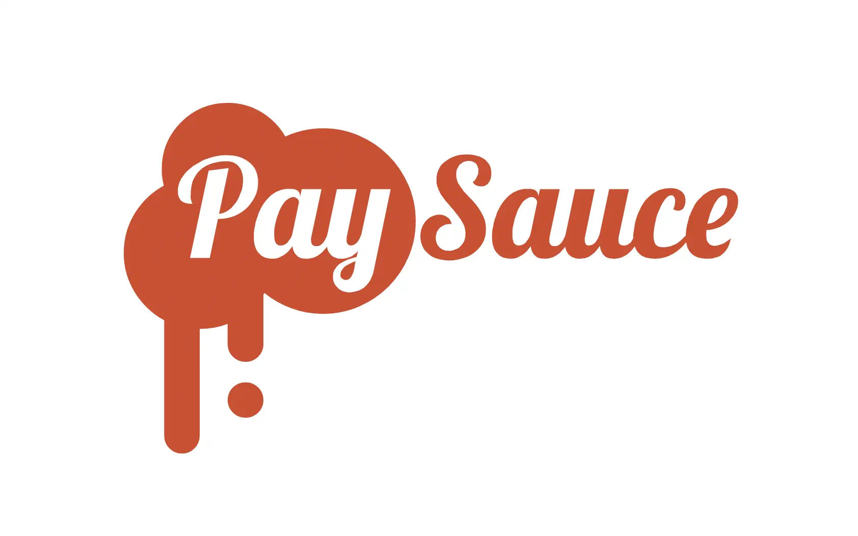
The logo needed to:
- be bold
it must stand strong when printed onto various things - stand out
a colour which is not heavily used by our direct competitors - align with the name
to help be remembered
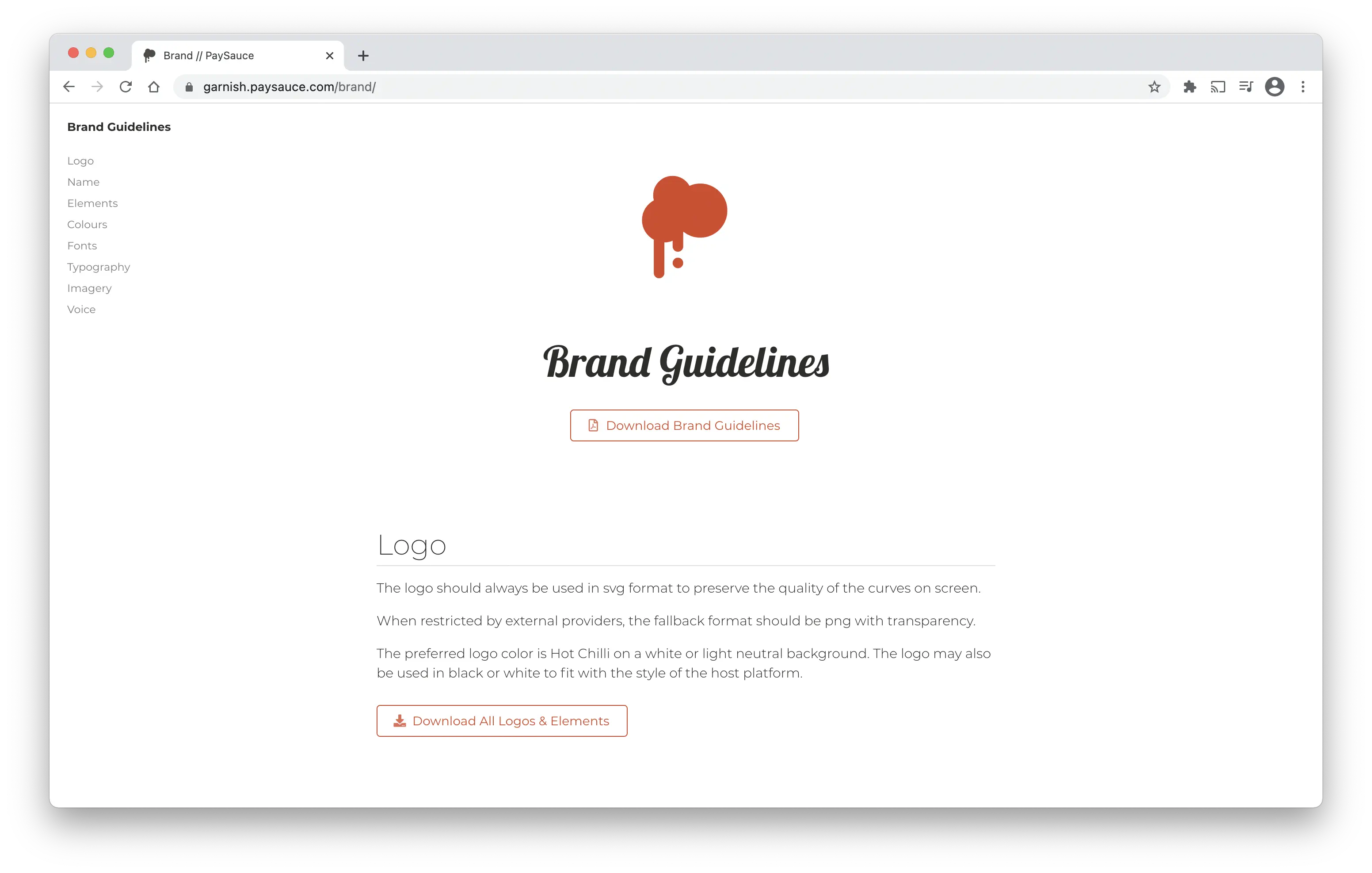
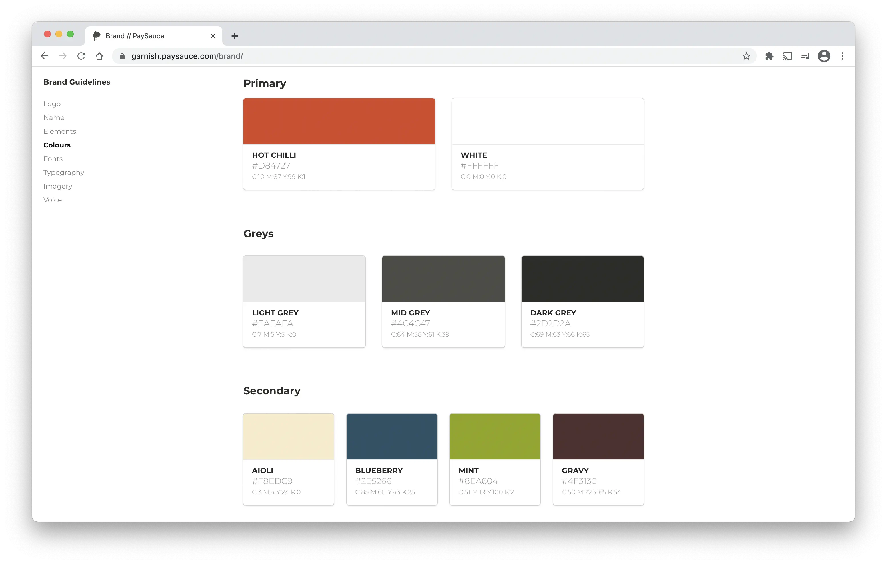
To help facilitate the correct usage of the brand, I put together a Brand Guidelines to ensure everyone know how to use the logo, colours and fonts in the way it was intended.
Other items prepared for the brand launch included: